Designing Our Modern Country Kitchen
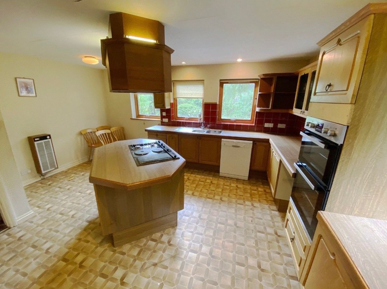
The first thing I thought of when I first viewed our house in Sussex was that the kitchen looked like the one from the film ET. Do you remember it? It was really dark and oppressive but strangely cosy. Ours was just like that …but without the cosiness!
One thing it did have was the most awesome pantry and a laundry onto an area of the garden where you could hang out washing. It was attached to what we knew as the ‘pink room.’ When our new neighbour visited as soon as we arrived to welcome us, she kindly slipped into conversation that the guy who used to live here died in his chair in there. It was a comedy moment and oddly never put me off the pink room. It’s always had great potential and a really lovely feel to it. No nasties in there!
The Before - from Rightmove
Remember the kitchen from ET?
When we moved in - same vibe as ET!
We lived in the kitchen as it was for a year, while we designed the new one and saved to do the refurb.
This was my wish list for the new space:
A light bright space
Keep some kind of pantry as we loved it so much
Create a way to get out of the kitchen onto the walled garden
A kitchen island
A drinks fridge
Close off the laundry from the rest of the room
As much work top as possible for cooking and preparing meals
Lots of storage
The ‘Before’
The floor plan showing the larder, cupboard and windows we removed
The ‘Pink Room’ when we bought the house
How we use our Kitchen
We spend most of our time in the kitchen. To me a kitchen is most definitely the heart of the home. If I’m not cooking I’m clearing or doing homework with the kids while I do the washing. There’s nothing better than sitting in the kitchen on a Friday with friends and a glass of something lovely. And even better when it turns into an impromptu kitchen disco and the utensils get raided for the microphones.
The new space above all needed to be functional for the way we live. This is the most important factor for any kitchen. It may look amazing but if you’re tripping over the dishwasher door to get to the fridge or opening the oven door into a walkway you’re going to hate it. We planned the space first meticulously and made some tweaks as we went. We changed our work top slightly by having an overhang on either side rather than opposite the stove as it meant we created a lovely long walkway through the kitchen and dining room which has worked really well.
We shopped around for the kitchen and went for a Wren kitchen as we found a design and colour in there we liked and the price was right. We could also get interest free credit which was helpful and made the whole project more affordable for us. Wren were helpful in helping us to plan the space and came to measure to check everything was spot on so we didn’t have to worry. We had a few of our own kitchen design ideas we wanted to incorporate to make it look bespoke which they were great at accommodating too.
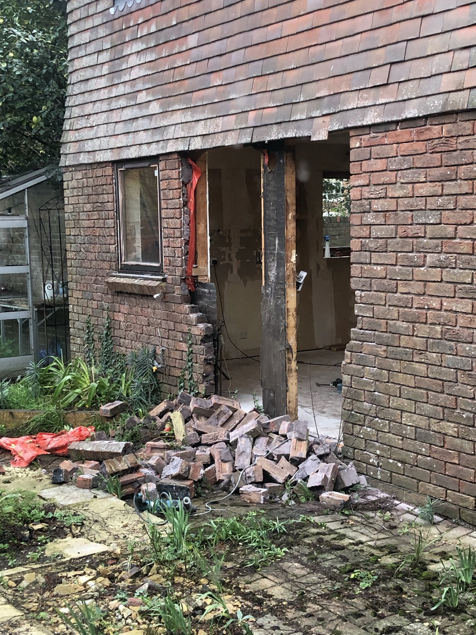
Knocking out the windows in the kitchen onto the garden
Door on before the glazing arrived
Pantry and cupbaord door removed to open up the space
Construction
Construction wise it wasn’t a huge job. Looking into the garden from the kitchen there were three square windows. We removed two to make a door way and had bespoke wooden doors made which we designed ourselves. As the whole house has a modern country feel to it I didn’t want to go for bi-folds, I wanted something more traditional. The doors both open to give the same open space and are on parliament hinges so they open right back to the walls on either side. Surprisingly this was a much cheaper option too.
We removed the pantry and a large coat cupboard that sat between the kitchen and the ‘pink room’ so we could open up the space into a larger kitchen diner. Our electricity board was in the coat cupboard but we were able to move it to just the other side of the wall into the laundry at not too much cost. We could hide it in a cupboard in the laundry. To close off the laundry from the kitchen we used a sliding door to maximise the space and create more storage in the laundry. It looks smart, works really well and is a nice design feature too.
Wren offered a fab pantry cupboard that we included in the kitchen design which offers as much storage as the previous pantry and uses a lot less space. It also doubles as the best hide-and-seek place and general ‘lets jump out at Mummy and give her a heart attack’ opportunity!
I love our new space. I can cook while the kids do homework or chat to me
I now have so much more workspace for cooking and preparing meals
Loving my range
Finally we broke the work top up by using a large piece of oak just to separate off a drinks or coffee area and make the design look a bit more interesting. It also made it slightly cheaper. In the end we went for an acrylic resin work top work from Wenbans that I love and is so practical. Our carpenter was able to install it himself using just a router which really brings down the cost and time of templating. It has a matt finish, looks just like quartz but was more cost effective and easier and quicker to install. Our carpenter was able to add the draining ridges and carve out the sinks and finish the edges quickly and easily.
Our new kitchen design functions well for our busy family life and I’m so pleased with the colours. We went for cashmere colour units which I love and used brass and rattan in contrast to the black range and hood which adds a really nice balance.
We worked closely with our builder and planned the project within an inch of its life to make sure we could complete the construction, plastering, full installation, new doors, plumbing and electrics within two weeks. We then painted and added flooring and the whole space was ready to make home in a month from start to finish. This level of detailed planning makes a huge saving on having a new kitchen installed. A lot of the costs of a new kitchen lie in the installation, so the less time that takes the better. It also means less disruption time which is a winner for anyone.
These are the cashmere units with brass handles and acrylic work top
This sliding door gives us so much more room in the laundry
The ‘pink room’ transformed
We’ve worked with a lot of clients on their kitchens, from designing a refurb and providing instructions on how to do it, designing a whole new space from the very start or designing a mini kitchen makeover that can really make a huge difference to how the space works, look and feels. We’ve designed kitchens locally in Sussex and also worked with clients online who are further afield. We can work on a consultancy basis charging by the hour or on a full project basis, we make it work the best way possible for our clients, to give them a space to re-love their home again.
We’re more than happy to answer any kitchen queries below just drop us a comment and we’ll come right back to you. And if you’re thinking about a new kitchen or simply upgrading the one you have then drop us a line and we’d be happy to quote on the design, installation or both.
Drop us a line if you’re thinking of having a new kitchen installed, we’d be happy to help.
More About Kitchens
Blog Articles:
Reels:


