Interior Colour Trends- Colour Inspo for 2021
Pantone is a universal colour matching system used across design, paint, even make up to refer to exact colours.
Oh I love me some colour! When I was working in brand marketing I was one of those weirdos who loved a Pantone chart- a proper colour geek. I loved building brands and deciding on the colours that worked best to reflect the product I was working on. And now I’m still doing exactly the same thing in interior design - applying the same principles to a room, the personalities who live in it and the mood I’m creating.
What I think I love best about colour it that the possibilities are just endless. You only have to go through a colour chart to see shades you’ve never really noticed before. Colour can set a mood, it can lift your spirits or make you feel down in the dumps. Then of course theres light - depending on how much light is on a colour it changes again completely. Don’t even get my started on Mother Nature and the endless colours that inspire me daily - when you really start to notice it’s a bit of a mind blower - the dark blue sky just before it goes dark, the bright oranges and reds that Autumn is about to throw at us and the bright greens - every shade of green that we’re lucky enough to be surrounded by here in Sussex.
Going Wrong with Colour
But you can also go very wrong when you’re choosing colour for a home improvement. One of my biggest colour faux pas was with an old spare room design. I had bought a gorgeous mustard velvet cushion at a Marie Claire sample sale when I was working in London. I had decided that I was going to decorate the room around the cushion using really soft greys alongside this striking mustard. I was all set, painted the room and had chosen a blind to match said cushion for the window. But when I put it up I realised I had totally failed to consider that the window frames were wooden - a dark brown. The mustard clashed horribly and the grey against the brown just looked …..yuck! So I painted the window frames white but I couldn’t just do that room…..well you can imagine how it went. Now the window frames always needed to be painted, but that’s not the point! The moral of the story is that colours can clash and you need to be careful how you use them together.
Colours in Fashion
Colours are also very fashionable which is always really interesting to follow. Personally I’m not a huge fan of using too much of a fashionable colour as it dates super quickly. But it’s nice to get involved sometimes. What I always advise is keeping the high value items such as furniture neutral and adding any on trend items in the accessories or the paint so if you do get bored you can freshen it up much more easily and without breaking the bank.
Every year Dulux announce a colour of the year. It’s interesting to follow because it becomes like a trend forecast and reflects the mood of the moment. It’s a colour that you’ll first see in the higher end interior magazines and then start to filter down to the high street. Dulux pitch the 2021 colour as being all about having the ‘courage to embrace change.’ Well haven’t we all had to deal with that this year?!?
The 2021 Dulux Colour of the Year is Brave Ground. It’s a warm natural neutral and what I love about it is that it ‘connects back to the simple things'. its a gorgeous, natural, warm earthy tone that we can all have so much fun with.
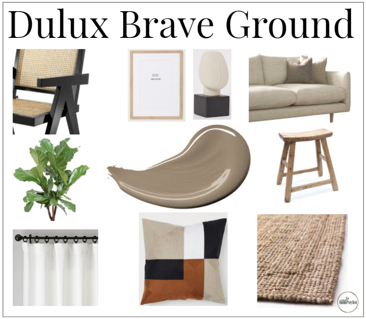
So how do we use Brave Ground in your room design? Trends at the moment are all about a very neutral base with lots of natural tones and textures. Think Skandi, think light wood, think pampas grass and think lots of clean, curvy lines and shapes. Think Japandi (I’ve only just discovered this term I love it - its when you mix Scandi and Japanese influences) and add lots of black as an accent. Think no fuss, no frills and not a lot of colour! Brave ground compliments all these natural tones beautifully and really warms them up, creating a lovely natural, calm and mindful vibe.
But how do we really use this in our homes? I’ve put together a little mood board showing how I’d incorporate it:
I’d veer away from painting your whole room in Brave Ground in the UK. If you’re living next to crystal blue water on the coast of Morocco then think again but in the UK we have very different light, especially in winter. You don’t want to feel as though you’re living in a cave. But one wall? Yes. As an accent colour most certainly and as the perfect colour for your accessories - well now you’re talking!
This is one of Dulux’s schemes showing us how to use Brave Ground
I have to say that as much as I love all the neutrals, I’m simply lost without an injection of some sort of colour. Personally I love to do this at home through my art, ‘collectables’ and soft furnishings but theres no reason why you can’t mix Brave Ground with soft blues or pinks for example that totally change the look.
More interiors inspo from Dulux using Brave Ground with pinks….
…and blues
It also looks FAB against the rich leaves of an over size plant. I absolutely love it with the rich green colours.
The London Fashion Week Spring/Summer 2021 colour palette
It’s not just Dulux who are on the case with a colour of the year. Pantone themselves have launched the London Fashion Week 2021 core colour classics for Spring Summer and again it’s all about the neutral earthy tones. So get yourself involved, or if nothing else just have fun noticing now how the colours change in the shops and if you like them, then get involved!
So where do you start with colour?
First of all- don’t be afraid. if you don’t know where to start I’d make sure you consider the following:
1) What mood you want to create in the space? If it’s a calming space you’re looking for then these neutral tones will be perfect. If it’s light bright and airy then maybe think about a brighter base colour.
2) Your wardrobe will be a good indication of the colours you like to surround yourself with and a great place to get some interiors inspiration. Mine is full of neutrals and denim with the odd bright scarf, bag or shoes which pretty much sums up my house as well.
3) Try before you buy - When it comes to decorating walls I’m a huge fan of a paint sample. The best thing to do is to buy a roll of lining paper (about £3) and paint it - a big bit. Move it around your room to the light and dark areas and see how the colour changes. See if you still like it.
4) Will everything you have go with the colour? This very much depends on your budget but I’m not a fan of turfing everything into the bin everytime you want to change your room we should be getting better at recycling and reusing our furniture, so do your self a little ‘live mood board’. Pull in your paint sample, your sofa cushion, a few of your key pieces and lay them out on your flooring. Does it feel right? This is a great way of spotting any impending colour faux pas before they happen.
Then if this is all right then go for it, be brave and get the brush out. Theres nothing nicer than a lovely fresh room, I’m sure you won’t regret it. I’d love to see how you’re experimenting with colour and if you ever need any help just stick a comment down in the below I always love to help. Send me your photos or tag me in them. In the meantime, all this talk of painting is giving me itchy feet… I’m off to find something to paint!


