Reclaiming Regency Design - The Lewes Crescent Project
With great buildings comes great responsibility. This is something I’ve been lucky enough to really come to understand while working on my Lewes Crescent project in Brighton, a Grade 1 listed property built in the Regency era of the 1820s. I can remember as a kid driving through Regents Park in North London on the way to London Zoo, being mesmerised by the amazing buildings around the park. I was so desperate to go inside and see what they were like (story of my life, I’m so nosey!). In Winter when the lights were on inside and it was dark outside I got a glimpse of the high ceilings and the odd chandelier sparkling from the ridiculously high ceilings. I loved the grandeur, the symmetry and how consistent the design is along a whole street. How the roads curve and the buildings curve with it. I was a proper regency geek from a very young age. So when this project came up I couldn’t have been more delighted. A whole flat renovation and some great work by Archangels Architects, turning the old kitchen into a bathroom, moving the kitchen into the large living space, stealing some of the back terrace to increase the size of the bedroom and introducing a mezzanine level in a clever use of space.
History
First stop was to swot up on the history. Brighton’s Lewes Crescent Area is steeped in history and has had many famous residents such as Princess Louise (daughter of Edward V no less) and author Lewis Carroll, to name just a couple. A few of the houses even served as a military hospital throughout WWI. The Crescent itself is the largest in Britain, and used to consist of 78 individual houses which were later divided up into apartments at the start of the 20th century, to accommodate for the rising classes moving into Brighton with the introduction of the London to Brighton Railway.
As for the apartment itself, the building was where Dorothy, Millicent and Penelope Lawrence founded the Roedean School in an effort to provide improved education for girls, and this was another important historical factor to consider when designing the space.
In fact, all of this historical significance impacted how the design process worked. The property, like most in the crescent, is Grade 1 listed which means that both the inside and outside features must be restored to the original Regency style. Therefore, no alterations could be made to the outside appearance at the front, and things like air vents etc. had to be channelled all the way out to the back of the property, where there is a newer extension. These rules and regulations provided an interesting challenge but with a great builder we always found a way.
Research
For research into an old design style, I decided it was best to use old research methods… so I borrowed some books from the library!
‘Regency Style’ by Steven Parissien became my bible when it came to researching for a style that paid homage to the Regency era while bringing in a fresh sense of modernity into the space. Although, I probably could have bought my own regency property with the library fees that I owe now, was never good at that at uni!
Also, regencysociety.org, a Brighton and Hove based charity provided a tonne of information on regency conservation which definitely came in handy.
So, what design elements sprung from this research?
1. Colour
With less access to paint pigments than today, Regency design was fairly limited on colour. Parissien’s book detailed the most popular Regency colours, more muted darker tones, and from these, I picked out a pink, a blue and a green to incorporate into the design. This green actually became the central colour of the master bedroom and en-suite
2. Wall Panelling
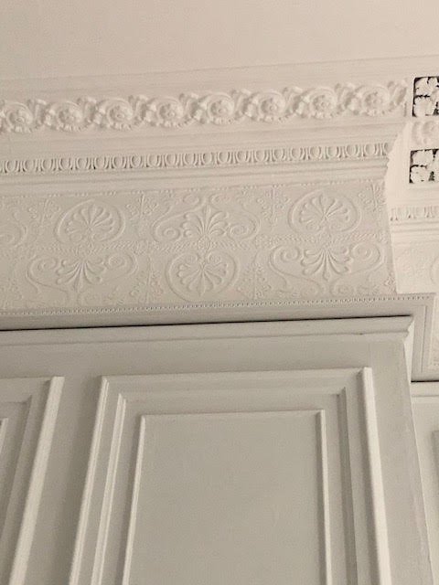
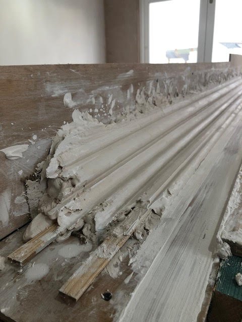
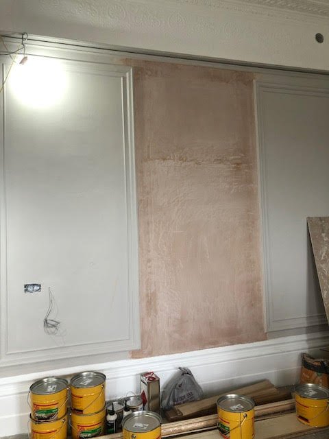
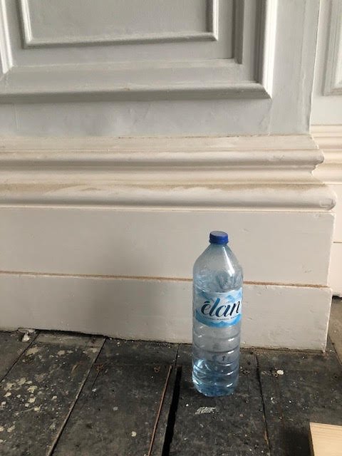
From as early as the 15th century, wall panelling & oak panelling were sought after for their insulation properties, protecting the homeowners from cold. Throughout the centuries, these became more ornate in more luxurious properties. The property had the most amazing original panelling in the main living space, with skirting almost up to my knee but some of it had been damaged, so the builder arranged for it to be replaced. There’s a few photos in my stories on how they did it, I loved watching them do it. We kept the ceiling and ornate cornice a bright white and painted the walls and panelling in Farrow and Ball Cornforth White which really makes the white features pop and emphasises the grandeur of the property, blending modern elements with the traditional.
3. Ceiling Rose and Chandelier
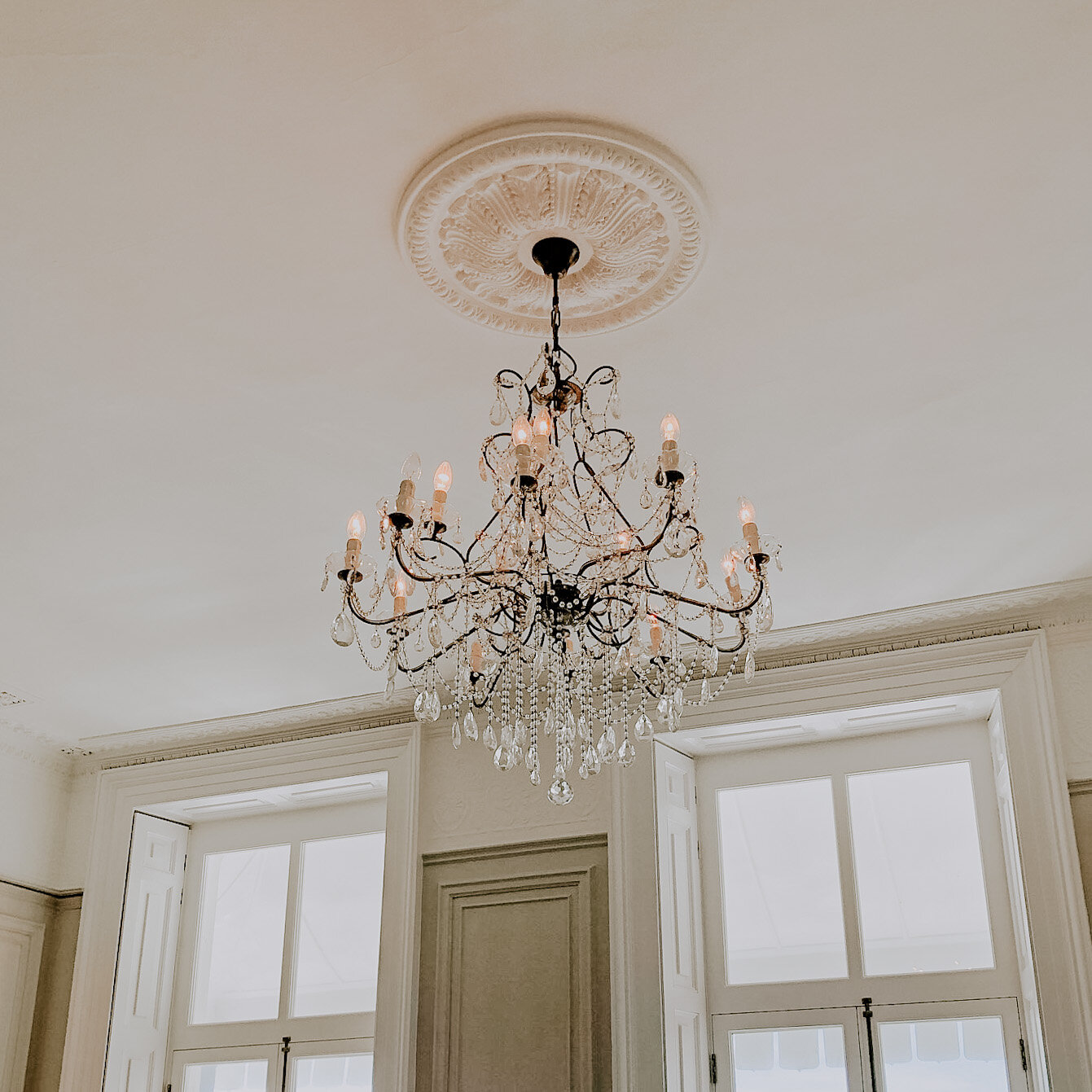
Plaster ceiling roses were initially used to protect the ceiling from the heat and charring of candles in the chandelier. Similarly to wall panelling, what once was a practical element became purely decorative, especially with the introduction of electrical lighting and candle-free chandeliers in recent centuries. In order to stay true to this Regency feature, I included an ornate antique chandelier (which my client and I had great fun shopping for!) that forms a part of the lighting design in the main living space, and there is an intricate ceiling rose above, which I sourced to match the designs originally seen in regency homes.
4. Balustrade
Before I was brought on board the original plan was to have a glass ballustrade on the mezzanine but I saw this as an opportunity to again give a nod to the regency design. The balustrade in front of the mezzanine snug area has black railings and spindles in the traditional Regency style, to not only pay homage to the era but to also bring an essence of the Brighton seaside and the railings at the front of the property indoors. The black complements other industrial design elements, but is combined with a lighter shade of oak in order to bring a fresher, brighter feel to the space.
5. Mirror
Having learned from the book about the ornate, decorative preferences of the Regency era, I decided to implement these when choosing a mirror for the living room. I’m sure you’ll see lots of photos over on Instagram once it’s installed, but the mirror is huge with brass edging that has detailed shapes carved into it and fits perfectly in the centre of the wall panelling above the fireplace to really bring the wow factor into the room.
Design
Going with the flow?
So, we know what design elements are needed to bring the Regency style into the property, but how do we make them flow throughout the whole space? Because there is a new extension at the back of the apartment, we have to ensure that the traditional styles are integrated through to this part of the property too. We decided that in order to do this properly, we not only had to bring in new Regency style pieces but also fully restore the original features.
As I mentioned, the hallway mezzanine was an important area because as a space where lots of movement and transition occurs, by including the black railings and Regency style spindles, a relatively plain space is transformed into a crucial area that ties modern and traditional together.
A similar thought process occurred with the marble fireplace because we wanted to keep an original looking fire in place rather than swap it out for a wood burner, which they never would have had in the early 1800s. Sorting out a fire that adhered to the heritage rules of the building was a real challenge and we had to compromise, but we got there and the look combines the original fireplace with a newer gas fire. I brought aspects of the marble into other rooms and sourced similar white marble for the kitchen counter, which is positioned opposite the fireplace, and did the same in the main bathroom. The Regency feature has stayed intact and also influenced other areas of the apartment.
The windows at the front of the building also underwent a full renovation, in keeping with the Grade 1 rules. We also then redid the windows at the back of the property in timber so that they matched the original wooden panes, no PVC here, please.
Lastly, these beautiful cast iron Castrad radiators in a beaten brass finish were chosen before I was asked to come onto this project, but they were perfect for paying homage to the traditional industrial style of mechanics in the 1800s. So, with these as inspiration, I brought in other brass elements to tie all the metals together in the form of taps, handles, doorknobs and of course the beautiful living room mirror.
Keeping History Alive
the timeless regency design that just gets better with age
The forward thinking girls of Roedean School
These pictures create a great talking point in the entrance way.
With Lewes Crescent’s rich history, it was really important to me to have this commemorated within the property somehow. After looking through the Regency Society’s photographic archive, I stumbled upon these two images from the James Gray collection which illustrate the area in its heyday perfectly. I had them framed and they take pride of place in the hallway, bringing the story of the building to life in this historic home. The first is a photo of the street in the 1930s-40s, and I love how not a lot has really changed since then. The second is a photo of the women of Roedean school in 1890, learning archery with one of the founders pictured in the centre. I absolutely love this photo, and I’m glad that this group of cool women will get to be appreciated by all who visit the house from now on.
The finishing touches
Interior design plays an essential role in keeping traditions, styles and history alive and I hope I did this beautiful home justice. It’s so important and I was so honoured to play a role in bringing this gorgeous property back to life. More photos to come!!


