Case Study: Upgrading A Family Kitchen Online
Lockdown has taught me an awful lot about a lot of things. It turns out that I’m more of an introvert than I realised I was, if I don’t get time in my own space to recharge I’m useless. Sadly I’ve also learned that a lot of things I’ve always said I was going to do when I had more time are just never going to happen and some of the things I’d love to be just aren’t going to happen right now- I’m not a reader, I’m not a great cook and I’m not very motivated when it comes to exercise. But there are some good realisations to have emerged. I absolutely love walking and being outside and it does more good for me than I ever realised. I love the work I do and miss it terribly when I can’t do it, and the big one- despite my love of personal interaction, a lot of things can be done online without having to compromise. Design can be done online- I’ve always been dubious but I’ve been pleased to be able to prove to myself that it can be very effective.
A previous client messaged me during the very first few weeks of lockdown to say that they had realised that they needed to update their kitchen and were going to make some changes and could they run them past me. I was honest and said that I didn’t agree with what they were doing and put some ideas down for the kind of thing I thought they’d like.
Fast forward 8 weeks and I’ve just been and peered through the doors from the garden and it looks FAB! They’re so happy with the change and I’m delighted with how easy it was to manage the project online.
The Brief
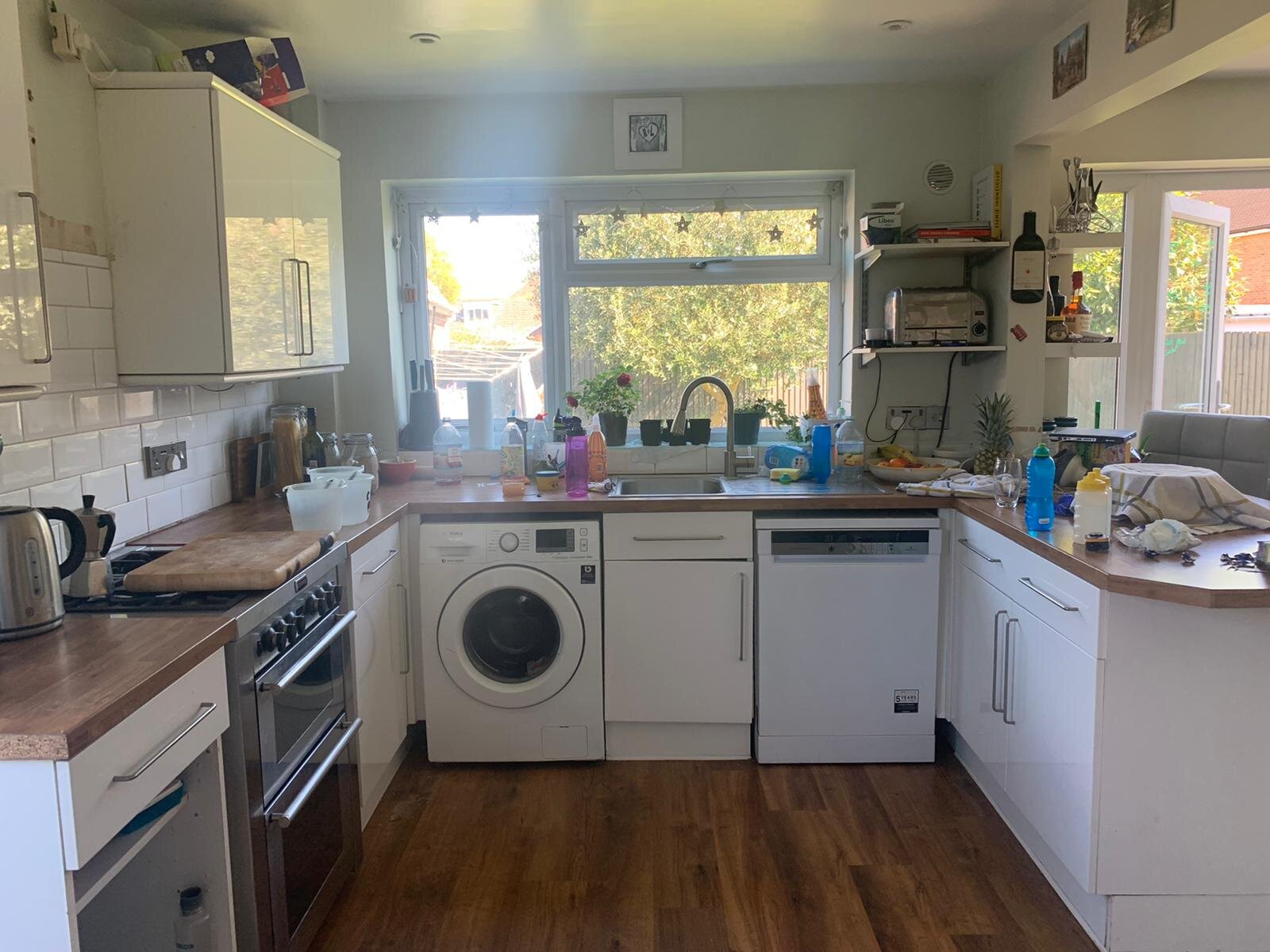
It started with a chat about colour. The brief was to ‘tart up’ the kitchen on an absolute minimal budget. Their kitchen is the heart of their home, a busy bustling space often full of kids scoffing tea and mums putting the world to rights. They wanted it to be more modern, less cluttered and a bit different.
They have an existing white gloss kitchen with wooden tops and a laminate wood floor, a wooden table and chairs. All of which needed to stay. I offered some tips on how to declutter their kitchen space, more on this can be read about in our blog.
So we went for something a bit braver. We went for lots of natural textures on a backdrop of a modern neutral and jet black feature walls. We added some shelves to add some personality to the room and kept their much loved photo wall but with some tweaks.
How did it work online?
It started with photos - lots and lots of photos. They also sent me a 360 degree video of the room and we FaceTimed so I could ask questions and they could show me what I needed to see.
We were able to go backwards and forwards with photos from Pinterest, sketches and more photos until we got everything just right. I did all of this from my new home office space which I styled up to make it feel like my own. If you’re also trying the working from home way, check out my blog on how to style a beautiful home office.
They did any measuring I needed and subsequently all the decorating themselves. We were in Lockdown don’t forget! These guys have always been really handy when it comes to decorating and DIY, they just wanted my help pulling the scheme together. I can work like this or stay in touch with a client’s decorator to make sure the job matches the brief exactly.
We were in touch regularly throughout the whole project with me offering support on paint through to shelf positions. It all worked surprisingly well.
So here it is, a very budget kitchen ‘re-love’ that was easy to do and extremely effective. For more tips to style your home and not just the kitchen, why not check out our tips here to re-love your home on a budget.
If you have a project you’d like me to help you with please drop me a line. I’d love to hear from you.


